Part 2 : SuperDryStore eBay Shop – The Good Points
 Lets start by looking at SuperDryStore ebay shop, you can view it here: http://stores.ebay.co.uk/The-Superdry-Store. There are definitely some great points to be noted and also some silly mistakes. I’m looking forward to explaining these to you in the next few paragraphs.
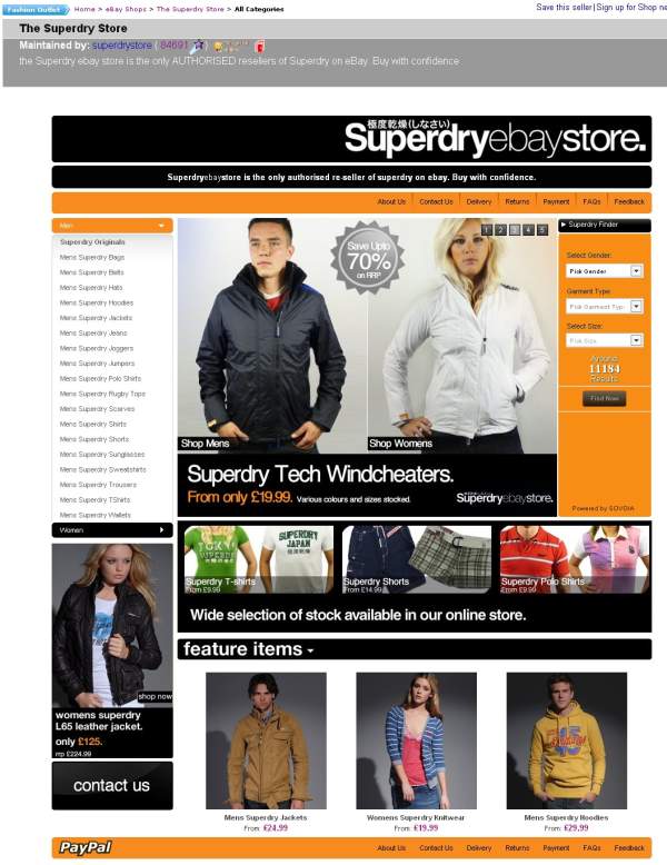
Here is a full screen shot of the SuperDryStore eBay shop:
The Good Points
Lets start with these, its very easy to be negative and point and poke’n’point at someone else’s work, but thats not constructive and there are some great things to note; In no order of importance, these are:
- High Impact Design
It has to be said, that branding is absolutely key. In this instance the ‘SuperDry’ logo is melded nicely with the ‘eBay Store’ text (note on this later).Then use of three primary colours, black, orange and white (yes white is a colour) is great, the objective of a great design is to carry across the companies ‘branding’ and to be ‘rememberable’.Jump of their page for a few moments, then ask your self ‘if my life depended on it, could I draw their shop’, if the answer is yes, the company has done a pretty good job. - High Quality Images
This is another key factor to a great looking design. If you have poor image quality or a sheer lack of product or lifestyle imagery then you’re letting yourself down.While I feel there is a lack of a singular ‘front of house model’ (I’ll cover this later), the flash slides are good and have a common feel to them. Its very tempting to whack together some slides and upload them. Doing so will give a junk yard feel, sit down and draw a maximum of two slide outlines/templates and stick to them.Flash objects such as the one being used on the SuperDry store are very easily picked up using Google for free, if you are after a custom layout, flash developers are pretty darn cheap if you can specify exactly what you want. My guidance on this is be wary of total file size of the flash object and the slides and keep to common theme and template the slides, so not to ‘visually confuse the browser’.If you are thinking ‘High Quality Images’ are expensive, get real. Lookup iStockPhoto and start searching, also you can use images from Flickr if you read the licenses properly. Take the header image of this site, as part of the creative commons licensing, I was able to use the above image as long as I post and link back to the author. Oh and if budget-challenged, try Paint.net its a free image editing software and is excellent.
- Organised Layout On-The-Homepage
The note here is ‘On-The-Homepage’, I’ll cover off the sub pages later. Its what I call a ‘Split 2 column layout’, there are two main columns, but the right content block for the first section is broken into two.Categories categorically go on the left.Now there there is room to maneuver on this for homepages, I’m sure you’ve seen how the vast majority of the bigger internet shopping sites will move from 1 column layout for the homepage, 2 column for category view and then either a double or single column layout for the item detail pages.I’m a bit disappointed about the limit of just three real items on the bottom, I’d have personally preferred six and from a wider product range.  Clarification on being ‘the only official outlet’
When you have an unique selling point, SHOUT ABOUT IT. The statement below is pretty good:
“Superdryebaystore is the only authorised re-seller of superdry on ebay. Buy with confidence.”I’d however suggest they alter it to:“Buy direct from of SuperDry, Quality, Service & Value Assured”
But I do like the ‘the only authorised re-seller’ part and maybe the following is a short alteration to maximum impact:“Superdryebaystore is the only authorised re-seller of superdry on eBay.”
Although this is quite hard without knowing their business goals for the platform.If we think about this for a moment for your business, try and summarise what your business is and how it is different from every other business into no more than 12 words. Adding ‘Established 2006’ or similar are also killer terms, as they immediately add ‘age’ and ‘trust’ to a brand, especially if its situated below a brand logo.
- Item Picker

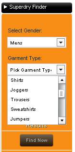
Now I suspect this is one of OBaid’s creations. Obaid is a developer that worked on Amazon.com’s TV picker. While I am not a complete fan off such ‘item pickers’ (mainly because I think it can be done in less code and be more widely accepted in Javascript) the decreasing numbers of items is cool and in this instance the levels have been well thought through, but some plonker has forgotten his alphabet when it came to ordering them!If you sell complex item types, then such a ‘tool’ is suggested to help your buyers locate the items they are looking for. -
Sex Sells – Use It
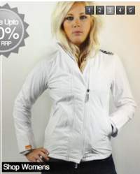
I don’t care if you take offence here, Sex-Sells and thats been a known fact since year dot.So… SuperDry have have almost got it. The woman on the left is pretty ‘fit’, the same for the model in the middle ‘featured items’ section. However the minger, I mean ‘model’ n the flash gallery could at least simile and push the chest out. The same goes for the male model, bush the pec’s out and hunch forwards a bit more.When some is buying an item, especially clothing, ignoring the brand, they are asking themselves ‘will this make me look good’ and if the model looks great in it, then that helps them to believe they will do too.
This does not mean, getting a lap dancer and a male stripper, it just means if you use a model, make sure they look hot and push their ‘assets’ to help the customer make a decision on whether this item is good to make them look ‘great’.
- Content Pages
At least SuperDry has actually created some shop pages, most sellers don’t even know they exist let alone use them. The content is pretty poor, but 5/10 for actually using them. See http://stores.shop.ebay.co.uk/The-Superdry-Store/About-Us.html as an example.If you’re not using the shop pages, then you’re missing out, see http://pages.ebay.co.uk/help/sell/stores.html for eBay’s pants help files on the subject (there isn’t one). I’ll be covering this off later in more detail.
The ‘Good Points’ Summary
I think I’ve remained pretty positive so far. There are some good points to be learnt from SuperDry’s store, even though I suspect they got it for free from eBay’s Indian designers whose designs have been pretty crap, eg Dune, hell, them all bar Office Shoes.
Just remember these key points for now:
- Great Quality Design.
- Organised Layout to Industry Standards.
- Promote your ‘Unique Selling Points’ (USP(s)).
- If you offer complex items, make it simple for the buyer to find them.
- If you have control over whom is wearing or sporting the goods, put the best ‘assets’ forwards, it sells.
- Use content pages, with proper content.
Next Time
Keep peeled for the next instalment [I’ll be getting the daggers out] as there are some shockingly silly mistakes that are being made. After I’m done you won’t be making these same mistakes and it won’t cost you hours or thousands of pounds either.


You’re crazy, you should charging them for this.
Interesting point on the shop pages, we use them with the ebay shop tags and lol! at the “eating of wasp’s”
Chris