How To: Knowing the 10 eBay Shop/Store Design Mistakes
Oh how these drive me nuts, please, please do not make the same mistakes. We can’t blame the shop owners featured in this article, they just don’t know better. You however cannot use this excuse after reading this article though!
Top 10 eBay Shop Mistakes
Here are top ten common mistakes sellers make when designing their eBay shop.
#1 The Giant Header
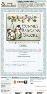
This award goes to http://stores.ebay.com/connies-bargains-galore
Check the header area out on this page!
Navigating the page to the line items means you need to scroll an entire page (yes an entire page I could not believe it) and more to get to them. Plus the header is on every page, so they’re all doomed pages.
Matt’s Tip: Keep your header to 250 pixels high as a maximum, anymore than this leaves the buyer having to think what to do next and we all know that’s a bad idea.
#2 The logo is not a Link
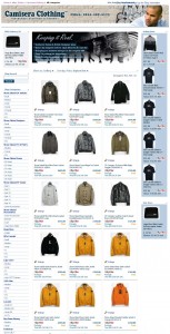
This award goes to a previous winner, http://stores.ebay.co.uk/Camisera-Clothing
Oh how this drives me nuts, the logo in the top header should always be a link, I covered this off in an earlier article, you can see the full details My #1 Pet Hate of Poor WebSite Design
Top left logo = Link to Homepage
Never forget this. Its basic common manners on the net. Making user the think again is a bad, bad idea.
#3 No categories
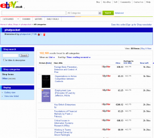 Awarded to: http://stores.ebay.co.uk/phatpocket
102,169 that is over one hundred thousand items and no categorisation?
Even adding categories by Author Name (which they have, see the listings) would help.
You can have up to 300 categories, three levels deep, there is really no excuse for this.
#4 No Description
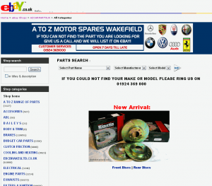 Awarded to: http://stores.ebay.co.uk/AZCARPARTSUK
Take a look here http://stores.shop.ebay.co.uk/_sl.html?_an=1 and note that these are anchor stores, each paying £350 a month to be in this list. Now how many have no description?
Even though this store uses a custom header, you can still fill out the shop description area, because this description is not only used in the header, the shop search page (which we just saw), but also in the meta description.
#5 CAPS LOCK
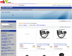 Awarded to: http://stores.ebay.co.uk/YES-4-CAR-PARTS
Using caps lock is widely regarded as SHOUTING, also using caps lock for all the text, does not make the text clearer to the reader, it actually helps the person typing the text.
Never used excessive amounts of caps text in a description, title, or in the case the categories because its VISUALLY VERY ANNOYING.
PS. I am ignoring the image in the header that is in the header, they appear to have forgotten to re-register their domain name
#6 Paying for a design but forgetting how it will look
 Awarded to: http://stores.ebay.co.uk/megabooksuk
Never fork out cash for a design without seeing how it will look with your information in it.
I’m guessing that if this seller had realised that they have no categories and that they were not using any gallery images at all for their listings, they might have ended up with a different design and layout.
It all looks a bit bare.
#7 Forgetting the rest of the Shop
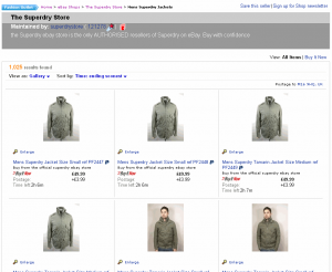 Awarded to: http://stores.ebay.co.uk/The-Superdry-Store
This one is brilliant and had already earned a ribbing in six articles, you can view them here: http://lastdropofink.co.uk/?s=superdry
So what’s wrong? They have a stunning homepage, but kinda have forgotten about the rest of the eBay shop, no categories, no real header, no left navigation, just a stark white page. This is the best case of ‘homepage blindness’ I have seen in years.
#8 Not doing anything
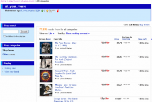 Awarded to: http://stores.ebay.co.uk/all-your-music
Well, lets be fair here, they did open an eBay shop, 1/10, but have left it as that. No categories, pretty sure that the default design, no description, no logo, no nothing.
Quite sad really.
#9 Main logo, not a home link
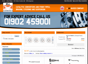 Awarded to: http://stores.ebay.co.uk/RSJ-Motor-Factors-Ltd
Nice design, although was a contender for #10 spot, however as I was typing I spotted the issue. I recently included this in an article My #1 Pet Hate of Poor WebSite Design.
They’ve forgotten to realise that the default user action to go back to the homepage is to click the icon in the top left, the logo part where RSJ is written, sadly this entire header contains no a single link, so the browser is left flapping with no-where-to-go.
#10 No custom pages
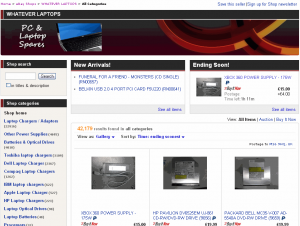 Awarded to: http://stores.ebay.co.uk/WHATEVER-LAPTOPS
I’m not knocking this store to much, the owner has completed a great job, added a logo, changed the header, added a shop description (not shown on this layout, but it is there), has really nice categories, two feature boxes along the top, nice product images, decent titles.
But has not picked up that there are up to 15 ebay shop custom pages to be abused.
Not making the Common Mistakes
For those eager readers, yes the lack of header logo link is here twice, it drives me bonkers, don’t do it! Its like a door to a house, but with no handles.
I know its really hard, there is normally a lot going on in a small sized business, its not surprising I was able to find all these issues in a few pages. But at least you now know what the most common mistakes are and to avoid them.
I have been working two other articles on the eBay shop, these are linked to below, the first article is already live, the second is due in the next 2-3 working days:


Trackbacks & Pingbacks
How To: Knowing the 10 eBay Shop/Store Design Mistakes
http://t.co/qBtUcgATgB
How To: Knowing the 10 #eBay Shop/Store Design Mistakes – http://t.co/3YdZMCoq
How To: Knowing the 10 #eBay Shop/Store Design Mistakes – http://t.co/rlxZkp8u
Leave a Reply
Want to join the discussion?Feel free to contribute!