The New eBay & What It Means for You (Podcast & Video)
You can’t of missed it, eBay has a new logo, but what they have released in the USA goes deeper, far deeper than just a logo change, the way that buyers interact with eBay is fundamentally changing.
In this Podcast & accompanying video we give you the inside track on what the new updates are and how they’re going to change the way that buyers interact with eBay as this is the biggest buying experience change in 17 years.
We’ve got a very special guest in this session, Chris Dawson from Tamebay.com who was at the unveiling of the “New eBay” in the USA and he gives us the low-down on what’s changing and we walk you through step-by-step through the changes.
The Podcast Version
Because this update is so important we’ve released this two versions, this is the first version which can also be downloaded from iTunes and is audio only. Ideal for downloading to your iPod or droid, choose this version if you’d like to get the inside track on the updates when you’re on the move.
[powerpress]
Because this is may be new to you, above is a green play button. Press play and you’re listening!
If you’d like to download the Podcast for listening to on your iPhone, Droid or iPad you can do or you can press the “Play in new window” button to be able to listen to the Podcast while browsing. If you use iTunes, you can subscribe here for free.
The Video Version
In the video below we actually show you and take you through each of the sections of the “New eBay” from start to finish and in the rest of this article I’ll be focusing in on what each of the changes are.
The “New eBay”, The New Home Page
You can see the majority of these changes live on eBay.com right now and I urge you to go there and open eBay.com up in a separate browser tab or window so you can follow these changes along with the video and this article.
“The whole eBay landing page has changed”
The whole eBay landing page has changed and we’ll be working top down looking at each element in-depth to see how it’s changed and is going to change the experience for buyers on our favourite marketplace.
New eBay Header Bar

You can’t miss it, the new header bar is huge and dominated by the massive search box. This search box is 51.2% larger than what we have on the eBay.co.uk site and is carried across all the eBay pages, right up to the checkout.
We’ll have a unified experience for all pages and really highlights the importance of the weighting that eBay are putting in their search right now and also in their pending release of Cassini (a brand new way of delivering personalised results on eBay) that hasn’t had a date put on it yet.
 In the Podcast Chris felt it really important to stress that there are no changes to the way in which the search results are being delivered for searches. We know that eBay’s new search is coming, but for now it looks like they’re giving us these updates in bite-sized chunks.
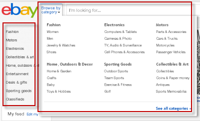
We’ve got the core categories shown in the upper part of the page and also the ability to browse by category using the link to the left of the search box.
I’ve highlighted these in the image to the right, and they appear as a new panel when you click on the right.
New Banner Area

It looks like the days are gone of homepage take overs, in the video version we saw that the eBay.co.uk homepage had been completely taken over by the Nectar points program. The Nectar points partnership is worthy of special note, but is this really what buyers want to see on their homepage? Hold on to that question because when you see what is coming up next, the answer is blatantly no.
The New eBay Feed

The new eBay “feed” is going to complete change the almost pointless homepage (in comparison) which we have right now into a page that is higher personal and I can easily see this becoming the hub and sole entry point to items for buyers over time.
“The new Home page is a page dedicated to what you and only you want to see”
eBay have created a mash-up between Pinterest and Twitter, where you’re able to see products in a similar format to Pinterest, but you’re able to easily follow and search groups to return the results in your feed that are highly personal to you.
If we ignore how customisable the feed is for a few moments, this scale of this single change is immense, the homepage has turned from a flat, boring page that shows a few semi-related products into highly personalised stream of products that are focused on only your tastes, the tastes of your buyers.
Setting up Your Own Customised Feed
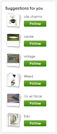 You can test drive this by going to eBay.com/feed, on the left there is an option called “edit my feed”, using the same massive search box you’re able to enter your keywords of choice and see the potential results that would appear in your feed.
You’re also able to drill them down by category, format, condition and also price range to really home-in on products that only you are interested in.
Then after choosing your keyword groups, go back to the homepage and your feed, now personalised to your tastes, will be showing related items.
As you scroll down the page, the feed only stops when it runs out of items and as I found when looking for “BDU” (“battle dress uniforms”) sometimes you can pick up unwanted items, to remove these just hover on the product and click X in the top right and the item is gone.
Annoyingly you are taken back to the top of the page when you remove an item from the eBay feed, but eBay learnt from what you don’t like and admittedly after I removed about 15-20 baseball cards that had been appearing in my feed, I have seen little of them since.
You’ll also notice that the eBay “Daily Deals” are not featured at the top of the feed, I had expected them to be there, but instead you find them further down after scrolling.
Not what I had expected at all and if anything, this clear shows that eBay are expecting buyers to scroll this page and after you play with it for a few minutes, you can see that they will.
Dabbling in the Future of the Feed
 We do dabble in the future in the Podcast, suggesting that if eBay take their newly acquired Hunch technology which provides what they called a “taste graph of personalised recommendations” to what eBay might have install for us.
So as Chris explains, after buying a bed, why not show him other related items, as a bed is normally a once every few years purchase, but if you look at it from a wider angle, we now know he has a bed, so why not show him accessories, like linens or a duvet?
I’m a size 9 or 10 shoe, so I’m not interested in other sizes, if you’re a size 12-14, then why on earth would you be interested in a size 16 or size 8? Hunch could have the power, when combined with the item specifics we’re entering as businesses to really tailor the results exactly to your personal requirements.
Will ‘Hunch’ provide us with this kind of customisation? That is only to be seen in time, but if we’re thinking we know the boffin’s in eBay are too and as this is only the first incarnation of the personalised feed on the homepage, I’m betting we will.
The “New eBay”, The New Search Page
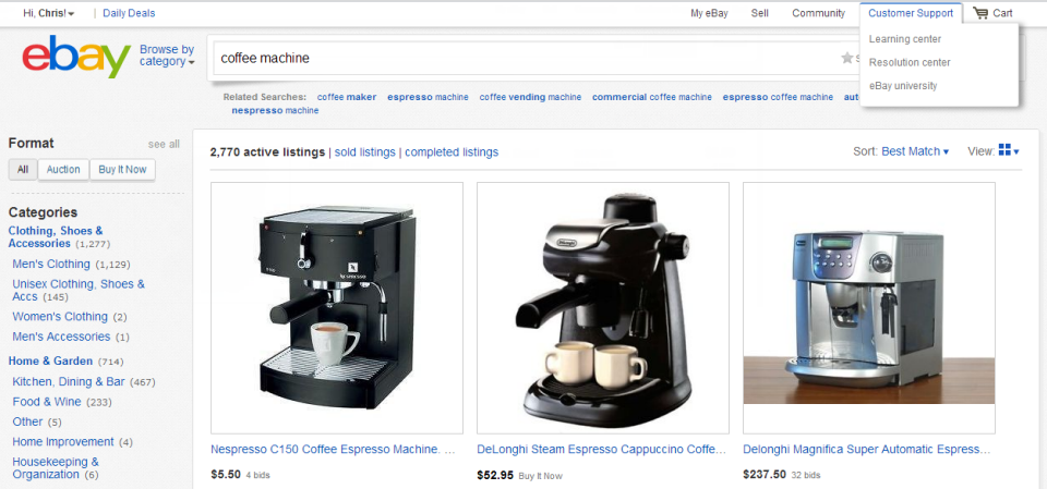
Chris explained that it is only the formatting & styling of the search results that are changing, the way in which the results are returned on the rest of the eBay site is exactly the same as what it was before the update, but now they are clearer and have had a face lift.
There are two views of listings on eBay the list view, which is where you see one item per line and the gallery view where we see multiple items per line.
Currently in the UK we have four items per row in the gallery view, just like the list view, the main image is being increased in size from the current size of 225×225 pixels to 300×300 pixels, it’s a 33% increase and highly noticeable and there are just 3 items per row.
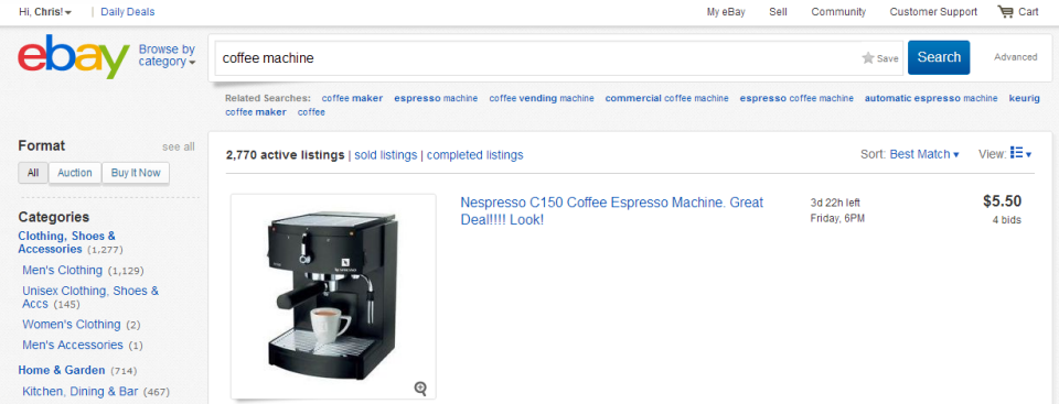
When it comes to the search results and also the feed, quality is really king here and we now understand why in the US that the use of image borders and extra junk in the images was removed, such distractions are not going to cut it in the new layout & design.
If we also look at the search results pages, the upper navigation has changed too, the format has moved to the left and also the filtering options above results have been made more compact and with easier access to sold & completed listings.
The “New eBay”, The New Item Detail Page
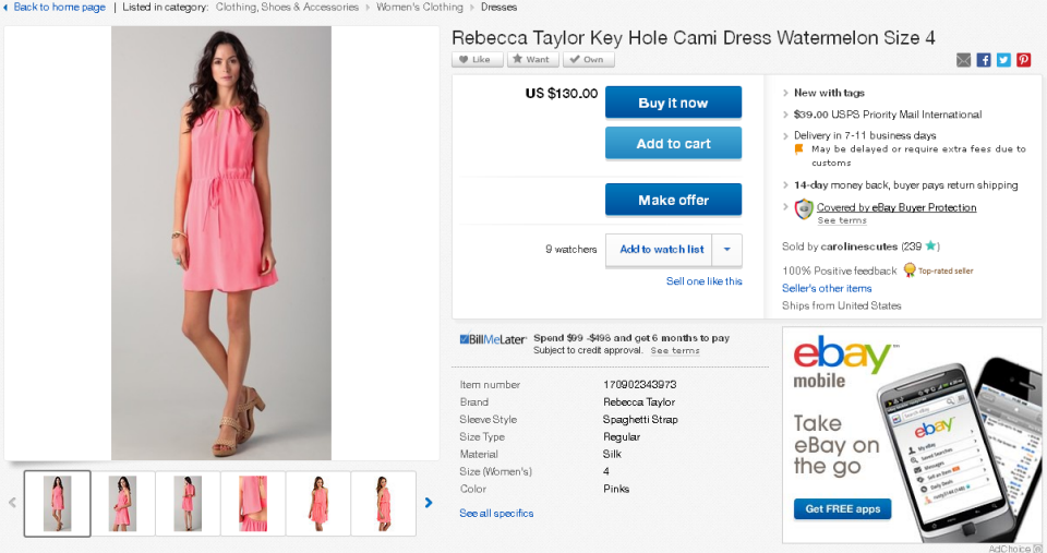
The item detail page has been set up for a complete revamp and there is a little surprise we were not expecting in there too. I wondered where it had gone and Chris noticed it too, Dave spotted it after a few moments and we’ll get to that shortly.
 We’ve now got a more compact listing layout, but with the information the customers needs to make an informed decision if this item is the right item for them.
The Images area looks larger but in fact it is the same size as what it was before (500×500 pixels), but why it looks so much bigger is because the amount of wasted space that has been saved on the right-hand-side of the main image is huge.
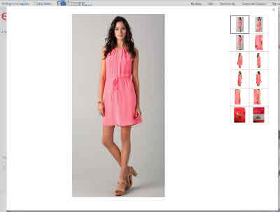
While zoom is now enabled on images that are large enough, with the images, the biggest change is the size of the lightbox. When click on the main image, a huge lightbox layer appears and overtakes the entire screen.
You can see this in the image to the right, that is the entire web browser window taken up with the product images.
Just one image isn’t going to cut it for most items now and as we can see with this item, there are plenty of images to keep a buyer happy as they fall-in-love with the dress and make the purchase.
Quarters
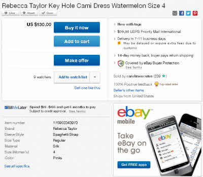 When it comes to the right-hand-side panel of the listing page, we’ve also have some major changes here too.
Annoyingly adverts are still present and take up one quarter (but that’s a topic for another day), the action buttons now have their own quarter, item specifics have been moved from that huge bar where they occupy above the description to their own quarter and we have a new section that combines both the seller information and the key facts about the item
Chris did point out in the Podcast/Video that there are too many options for buyers to click on here, if we count the options in the screen shot to the right there are 11 buttons, way too many for one page. Buyers need an “or” option, so their decision process is simpler.
If we focus on buttons only for “Buy it Now”, “Add to Cart”, “Make Offer” and “Add to Watch List”, that is two, too many options and really needs to be nailed down to “Buy it Now” and if needs must “Add to Watch List”.
Note: eBay’s “action colour” is blue, we can see this throughout the site, even in the advert eBay mobile, the action colour is also blue. While there maybe too many buttons on the page and to me heavily diluting power of the blue “Buy it now” you don’t have to make this mistake on your own site.
One of my favourite marketers is a chap called Derek Halpern from SocialTriggers, take a look at the video in this article to understand what is your action colour. The action colour on this site is green see the box below… Would you like to subscribe?
[scg_html_pos_subscribe]
Item specifics still take up a load of space on the UK listings currently, it’s a good 2-3 inches of screen pace the buyer has to scroll in the fashion category and now we can see in the screen shot, that these are still available, but have been tidied into their own quarter and if you click on these any item specifics that are not being shown, will then appear.
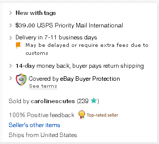 The big change is in the top right quarter, the items key details. The condition now links to the description area, we’ve got the first delivery cost and also an ETA on when the item will be with us, along with a summary of the returns policy and the buyer protection notice.
The surprise I mentioned at the beginning of this section is in what is missing, next to the user ID we have the sellers feedback, but the eBay store icon is missing. Considering how much effort has been put into these updates that cannot be a mistake and raises the question, what is happening with eBay stores?
In the UK there are over 400,000 eBay shops (we Brit’s call them shops, not stores) which drive a massive revenue stream for eBay, some £81 million each year. So when I see them not being promoted, especially in such a radical update I’m concerned. The eBay shop has the been the hub for almost all eBay businesses and I certainly hope we’ll be seeing some changes here for the humble eBay shop.

As you move down the page, we now have a unique bar that follows us down, so we can jump to each of the key sections, the description, shipping, seller info and the Q&A.
But what someone has overlooked, is the ability to buy from this bar. Where is the buy button? Seems to be the only major flaw we can find in the “New eBay”. Nice spot by Chris!
Note: In the video version of this article I’ve included an overlay to give a suggested impression what this could look like.
The “New eBay”, The New Profile Page
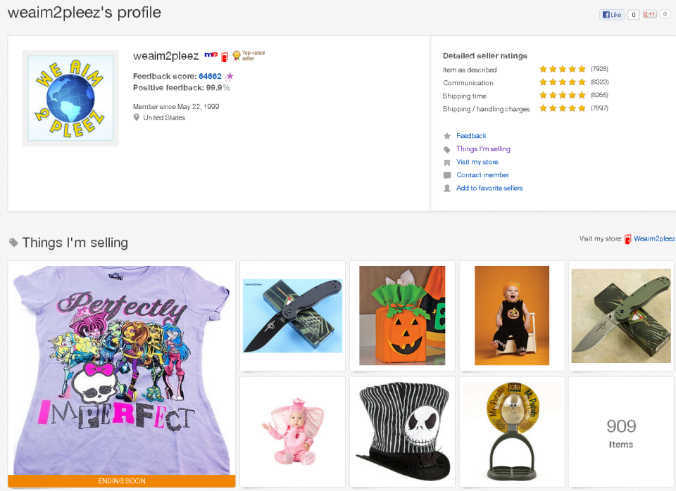
The next big change is to do with the “My World” page, you know the one, the pointless page where we’ve seen numerous failed attempts at getting users to update this custom page.
It’s had a complete revamp and you can see what yours will look like by going to http://www.ebay.com/usr/ and adding your user ID on the end of the URL.
Some important notes here is that there are now individual Facebook Like and Google Plus buttons and we again see a similar format of product images as we saw in the eBay feed page.
If you look at your own page, look on the right-hand-side, there is a feedback button that links to a survey here which asks “How effective was this eBay Page in helping you accomplish what you came to the page to do?” Is it just me or does that indicate to you too, that this page is somewhat useless? Would it linking to the sellers eBay shop not have been better and ditching this page all-together?
The “New eBay”, The New Checkout & Registration Process
The one part that we didn’t cover in the Podcast & Video is that eBay have changed the registration process and also the checkout process too.
New buyers to eBay only need to enter the bare information needed to start with eBay
The registration process now only asks for the information that is absolutely required to get started with eBay and then when an address is needed, that can be added the first time the buyer is in the checkout.

Image borrowed from Tamebay
A massive change to the checkout process is the ability to link your eBay account and PayPal account together, so instead of having to login and move through some 3 or more pages, you can complete the checkout on a single page, because the PayPal account is attached and there is no need to sign in to PayPal too.
The “New eBay”, Summary
Personally I have for a long time suggested that eBay is becoming Amazon and that has been true up until now. I’ve got to eat my words as I hold Amazon in high-regard for the way that they market and re-market products, but eBay just dropped the bomb on that and has left Amazon for dust.
I’ve got to hold this has the largest single change to eBay, well since ever. We’ve now got the ground work for a highly customised, highly personalised home page and if the buyers take to this, for which I am sure of as it just works. If we sprinkle in some magic from the eBay developers team, then we have something I don’t thin k we’ll see change for another decade.
 I spoke with Patrick Munden, Head of Seller Communications for Europe, he had these words to add:
“With the new eBay Feed, the buying experience is now going to be truly customised to each of your buyers. This only has to be a good thing for sellers as we’re putting the right products in front of the right buyers.
As a seller, the focus really is on quality, quality listing titles so your items are found and quality images, as the eBay Feed is image centric”
Just as Chris did, he’s hit the nail-on-the-head. If there is only one thing we can take away from this update, that is the quality, size & standard of images now required by sellers has never been so high.
I’d like to say a special thank you to Chris Dawson for giving us the insight into the changes that are included in “The New eBay” and you can find more about Chris and Tamebay, the numebr one resource for marketplace and eCommerce news in the UK over at Tamebay.com.
What Do You Think?
What do you make of these changes and how do you think this will change eBay over the next few years? Let us know in the comments box below.


Great Video, Cheers Matt, Dave and Chris. Really informative and having a video was really good.
Overall I would say the changes are looking nice. eBay becoming more and more amazon-ified with every single change, which in many ways is a good thing. The new items pages are much better; clearer to look at and structured in a better way. I am disappointed they are placing less emphasis on the shops, I think a lot of buyers like being able to return to shops/sellers that they have had a good buying experience from and this de-emphasis will make it even harder/ less likely for this to occur than it already is at the moment (which I would argue is already too difficult i.e. not being able to search shop names in the search bar).
The biggest thing that struck me was that a lot of these introductions will only really be useful for people who use eBay a lot. I think the casual eBayer will make very little use of the feed because it will be simply not relevant enough for them. In fact I think it would be simply seen as an annoyance. The key to this is HOW much use is required for the feed to start becoming relevant enough.
With regards to the advertising I am sure that eBay will find ways to get this revenue. You mentioned the outlet page takeovers. One idea that struck me was that outlets might be able to purchase a screen that buyers are directed to before they can reach their feed, much like eBay does with notifications about changes, free listings etc when we log in.
Personally I have to say I hope the changes don’t reach the UK pre xmas. I don’t want buyers feeling like they have to work out how to navigate the new eBay when doing their xmas shopping. I expect most people are like me and are stressed enough just trying to buy all the required prezzies without having to deal with a new layout too.
Howdy Dave,
Hat’s off to Chris to being able to give us the run down on the pending updates, we were able to see how deep the changes really go.
I totally agree on the store link being missing. I am being hesitant on this topic as I am putting quite a bit of faith in eBay that they know what they are doing with this.
The eBay Store is the hub of any eBay business, it’s eBay’s version of an eCommerce website and I sincerely hope that it will be treated as such, rather than just a revenue stream (see here) and to give us the tools we need to ensure that it really does become the true hub of activities, it has been washed over in the past updates and never has got the attention it deserves.
I’ve used hope a few times already, but I am hoping that they’ve got something up their sleeves with regards to the eBay Stores, otherwise it’s a real kick in the teeth for store owners, the only negative that can be taken from the “New eBay” for sellers.
On the adverts front, hate them, it’s why there are literally none on this site. I’d be a lot wealthier if I had them, but I don’t believe they add amazing value and if it’s not delivering that I’m not interested.
eBay did have the “Adcommerce” program a while back (text & picture ads for eBay only, kinda like Google’s Adsense), I think we were one of the few that licked it and did rather well from it and freely admit I was quite disappointed that it was shelved, because it worked.
There doesn’t appear to be any plans to roll “The New eBay” out in the UK just yet, but seeing as the US have it and will have it live across the board by Christmas, it’s inevitable that we will have it soon enough.
Chris made the point that this is a buyer update, not a seller update so will be separate to the normal twice yearly releases and also special thanks to Patrick Munden for chipping in too, I felt it also need that extra bit of reassurance from the eBay EU team.
Love the changes, but like you thankful the USA are receiving it before us and there is a huge question mark around the eBay Stores, or as us Brit’s call them “Shops” :)
Matt