ToysRus – Putting My Photoshop Skills Where My Mouth Is – The New Listing Template
This is quite an old article now. I have considered removing it and I have edited it slightly since. However I decided that it would be better to leave this and the other articles on the site, as with anything, experience is only learnt through fire, this was one of those times where I could have done better and approached the subject more tactfully.
I’m leaving it, as it shows I’m just a mere mortal, like us all.
Original Article
In a meeting today with a client, the topic of outlets came up and I explained about ToysRus and my post two days ago and how I thought it was amateur.
Phil [the client] quite rightly suggested that I should explain my actions, going around and pointing at things and saying they are ‘poor’, it isn’t on, prove they’re shit and explain why you think its better he said, this is for you Phil.
10 Minutes in Photoshop
I set the stop watch , well looked at windows clock and started, 10 minutes of my pr0 photoshop skills were unleashed. Thats right, I bodged this together in 10 minutes flat.
My point is that its not my photoshop skills you should be interested in, its my reasoning. I’ll shut up and lets get looking at my copy and paste jumble. But before that, lets do a before shot, then get to the happily ever after.
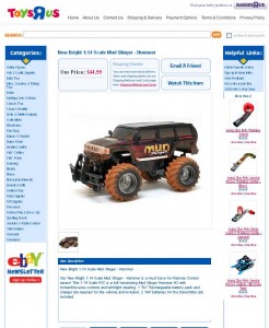
Before Any Changes
If you click the image above or you can view the ebay item here in the flesh and ore at its design nastyness.
10 Minutes of Photshop Hacks
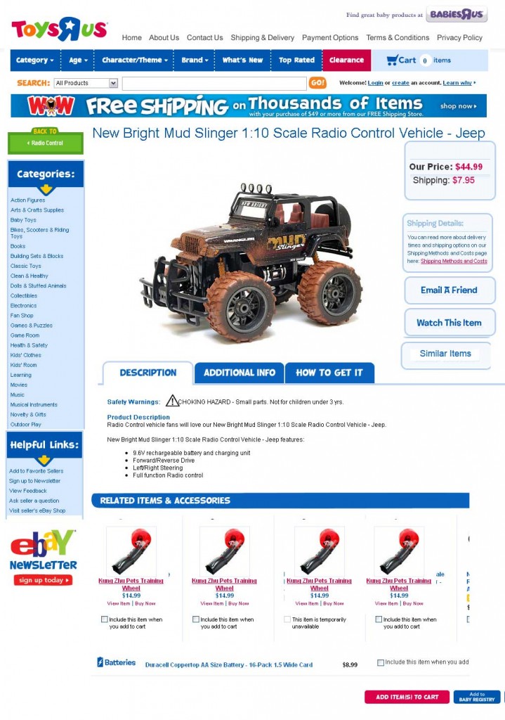
Yep, 10 minutes of copy/paste, chop and insertions, I arrived at this master piece.
Explaining My Actions
Now this is where if it wasn’t for another customer an great friend of mine who gave me a stark kick up the arse a few months back, I’d be keeping all this all to myself. Enjoy it, this is a professional nut case in action. Stand aside.
As Lisa said, its the application of ‘Matthew Ogborne’ that counts, anyone can point and poke but you[me] got the know-how, nows its for you to explain why and where and educate these people.
Lets go:
- I left the babyrus in the top right, this sits well with the websites and although that babys template is just as bad. Moving on…
- I kept the top eBay header bar from the listing, but I inserted the category bar from the website. (Yes that really is the cart section in the header, I told you, this was 10 mins flat in Photoshop, its one cut get over it. I am not that thick)
- The search box area needs work, I am not 1oo% sure on this area art all, it needs more than a few seconds chopping to set this right. Maybe where the cart is?Not sure at all. This defo needs some consideration outside of the post.
- Now that banner, brilliant idea from their website and exactly why what ever muppet designed this looked at their website with their eyes firmly closed. Yea it says free shipping, this is not my point, the banner existing is. Think of some USP (Unique Selling Point) and promote it, hey here is one. ToysRUs official eBay outlet, that’ll do for a few days to doge the negs.
- Going down the left menu, I spotted a neat little feature on the ToysRus site ‘back to’, lets set this as a link back to the shop home. OR wait for it…. drum roll… set it to the same category where this item is listed in. You getting it yet? You feeling it? I am saying WE know which shop category this item is listed in, so we can offer a ‘Back To’ link feature by using this to make the shop category link. Genius!
- The category menu is OK, personally I’d prefer a more well thought out category structure with sub menus, similar to the website, but with the limitations of eBay taken into consideration (eg only two shop cats per item).
- That eBay newsletter is bordering on miss leading, its implying that its from eBay, not that its Toysrus, its there because I think its needed, but it needs work to clarify its source.
- You’ll notice I have slipped in the ‘Helpful Links’ section on the bottom left. You betcha, that right hand side useless menu is a goner.
- Back to the top again and a full width title has been placed, this is crucial. Hold on to your seats here, stellar information overload coming.
You have 10 seconds to sell this item
- WTF(remember this term?) Matt, 10 seconds? Yep 10 seconds, you have just 10 of them before the customer decides to continue reading the rest or looks for a bail out option. So lets give them to information they need to make this decision in 10 seconds.
This is a research done by a company sellathon about 4 years ago, yes its old but I swear it holds true today as well. And yes the bullet point numbers in this list are now out :) - So with the right menu gone, we’re able to give the main image pride of place smack in the middle, BUT also reinforce the product message with some key information pointers.
- We show the selling price, shipping price and total it. Actually now looking at it, we need to do a little link for more info and drop that shipping box all together, its confusing.
- We have ’email a friend’ and ‘watch this item’ as before, but vertically, but I have added the ‘similar items’ box. This comes from the link I suggested way up in point #5. Have an exit strategy at all times, this item may not be the right one for the browser, so deal with it effectively.
- The description area was nicked from the website. a welcome replacement to the crap that was in the original design, ToysRus have a fun clean design, lets not cheapen it, but bend it to eBay.
- The last section, related items. by their name its related items. What I’d do here is actually offer two lots, one for true related items, like other trucks, but also accessories. This can be easily done with some Javascript that I have set as a blog post to be released sometime next week.
Summary
I hope from the above I have explained why I pointed at the original listing and said it was crap and have now given a full break down on how it could be bettered with a bonus 10 minute mashup photoshop visual.
If you can only learn one thing from these sets of posts on the ToysRus designs, is that do not be a yes-man and take the first design given to you, especially when its blatantly obvious its been done by a muppet designer who looked at the corporate image with their eyes fulled closed and missed all the good points and delivered something that I wholly think is substandard.


Trackbacks & Pingbacks
[…] already gone on a bender on this, you can see the full break down here, if only a single change could be made, add the shipping ( if CA can total prices?[doubt it […]
[…] put together the following post called ToysRus – Putting My Photoshop Skills Where My Mouth Is – The New Listing Template which summarize suggested changes. The template works, but it frankly […]
Leave a Reply
Want to join the discussion?Feel free to contribute!