We (Almost) Have a Winner! – Missguided.co.uk
 Back in October, one of my first articles was relating to a company called Misgguided. You can read the original article here What a Silly Design Flaw – Missguided.co.uk. They had just had a new website redesign, but neglected one crucial thing…
They had lots and I mean lots of keywords stuck in images.
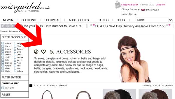
Before:
This is a before screen shot and was the basis for the article:
Looking Closely
And you’ll see that 38 words are hidden from search engines as sadly search engines cannot read words contained in images. Yes they can read ALT and TITLE tags, but having the description on the page is far more important.
And Today We Have?
Something different. While not so pretty as the first, they’ve not only remove the text from the images, they’ve also included the category links.
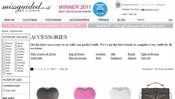
We have all text now, including new category links
Superb, Yes?
Nope. While releasing the keywords from the images and adding several as links into the sub categories, we’ve reduced out keyword weighting and also reduced the appeal of the header section.
First off, we’ve lost the style of the header, namely the particularly ‘fit’ model and the accessories line. I’ve high lighted these in blue below:
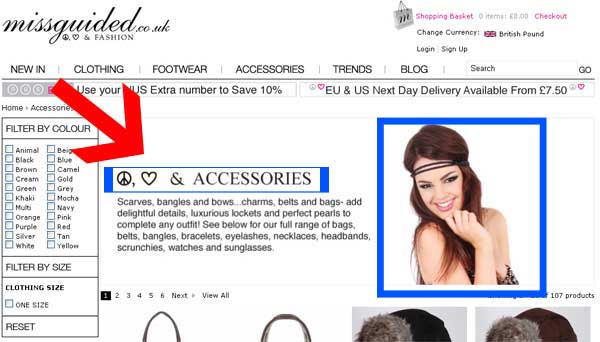
Loss of Two Key Sections
Also while actually gaining two words to the word count, we’ve lost the flow of the text.
From:
Scarves, bangles and bows… charms, belts and bags- add delightful details, luxurious lockets and perfect pearls to complete any outfit! See below for our full range of bags, belts, bangles, bracelets, eyelashes, necklaces, headbands, scrunches, watches and sunglasses.
To:
Get the latest accessories to go with your perfect outfit. We’ve got the latest trends to complete every outfit for all occasions.
Hats, Scarves & Gloves Bags & Purses Jewellery Gifts Beauty Tights & HosieryNail Polish Hair Accessories Belts Sunglasses Slippers View All
So What Would be better?
Join the two together, just like in the original article. We take the styled images for the category header name, the model, the decent description and the raw text and combine it together so it looks something like this:
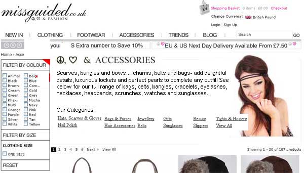
Excuse the Photoshop Skills, but it makes my point clearly
Anymore?
Yep. Check the top menu out, they’ve actually fixed the issue of the top tabs not being links themselves to the categories (pet hate of web designs #3, I need to find another example for this now), but have left a dead link in the header as shown in the image below.
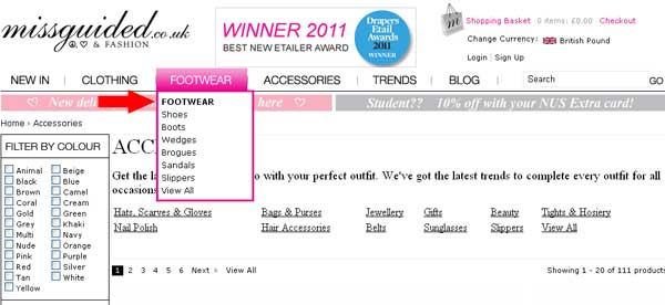
Category Menu Dead Link
Importance of Excellent Design
The visual appeal of a website is only one part of an entire picture of how the websites performs, I’ve worked with dire looking websites that have been successful because of the other factors far out weighing the lapse in design. Its when you get everything right, is when magical things happen.
Watch This Space
So watch this space, the earlier changes did not happen by accident. If you now see these changes happen you know where they found out about them ;-)




Hi Abbas,
I actually have a plan regarding A/B testing, what you’re suggesting is right, there is no straight swap/swap, but you can compare between similar items.
Hi Abbas,
I actually have a plan regarding A/B testing, what you’re suggesting is right, there is no straight swap/swap, but you can compare between similar items.
Any known examples of sites which you feel at near perfect Matt??
“when magical things happen.”- ha ha.. true…
Howdy Abbas,
For as much as I recently took the piss out of them on here for their utterly dire eBay botch job (see http://lastdropofink.co.uk/market-places/ebay/argos-is-kicking-ebuyers-butt-on-ebay/ ), eBuyer.com gets a lot of boxes ticked and I am a “Amazon Patriot” and Amazon get a lot of things right too.
What I’ve just realised that I have failed to mention, is that I have not included the importance of A/B testing, my suggestions only go so far, the rest needs to be based on hard-core testing to refine and further refine results.
Dell.com is a perfect example of a site that uses a process continuous measurement and testing in the ultimate reach of improving sales and customer satisfaction.
Yikes, these MBA case studies are going to my head, I need a caffeine break!
Matt
A/B testing would certainly help, but I wonder how it would be possible to implement this on ebay, since they ve introduced their duplicate listings policy, which means we cannot have perfectly identical listings?
Certainly agree to your views on dell.com! Even smashing mag features them regularly in their articles on best ecomm sites and best checkout processes…
Howdy Jay,
Yes exactly, take the best of both, the symbols and human element and combine it with the readable content for both users and search engines. Its a balance between the two, which they’ve just not got right (yet).
Fantastic! You’re right – no need not to keep those symbols as their own image next to the title.
Also – shame on losing the nice looking pic – loads of studies mention how use of human faces in-particular can aid conversion!
Jay
You are here: Home » Market Places » Website » We (Almost) Have a Winner! – Missguided.co.uk
← 11 Reasons Why People Don’t Buy From YOU & How to SMASH Them
We (Almost) Have a Winner! – Missguided.co.uk
Posted on February 24, 2011 by Matthew Ogborne
Back in October, one of my first articles was relating to a company called Misgguided. You can read the original article here What a Silly Design Flaw – Missguided.co.uk. They had just had a new website redesign, but neglected one crucial thing…
They had lots and I mean lots of keywords stuck in images.
Before:
This is a before screen shot and was the basis for the article:
Missguided With Lost Keywords Hidden in Images
Looking Closely
And you’ll see that 38 words are hidden from search engines as sadly search engines cannot read words contained in images. Yes they can read ALT and TITLE tags, but having the description on the page is far more important.
And Today We Have?
Something different. While not so pretty as the first, they’ve not only remove the text from the images, they’ve also included the category links.
We have all text now, including new category links
Superb, Yes?
Nope. While releasing the keywords from the images and adding several as links into the sub categories, we’ve reduced out keyword weighting and also reduced the appeal of the header section.
First off, we’ve lost the style of the header, namely the particularly ‘fit’ model and the accessories line. I’ve high lighted these in blue below:
Loss of Two Key Sections
Also while actually gaining two words to the word count, we’ve lost the flow of the text.
From:
Scarves, bangles and bows… charms, belts and bags- add delightful details, luxurious lockets and perfect pearls to complete any outfit! See below for our full range of bags, belts, bangles, bracelets, eyelashes, necklaces, headbands, scrunches, watches and sunglasses.
To:
Get the latest accessories to go with your perfect outfit. We’ve got the latest trends to complete every outfit for all occasions.
Hats, Scarves & Gloves Bags & Purses Jewellery Gifts Beauty Tights & HosieryNail Polish Hair Accessories Belts Sunglasses Slippers View All
So What Would be better?
Join the two together, just like in the original article. We take the styled images for the category header name, the model, the decent description and the raw text and combine it together so it looks something like this:
Excuse the Photoshop Skills, but it makes my point clearly
Anymore?
Yep. Check the top menu out, they’ve actually fixed the issue of the top tabs not being links themselves to the categories (pet hate of web designs #3, I need to find another example for this now), but have left a dead link in the header as shown in the image below.
Category Menu Dead Link
Importance of Excellent Design
The visual appeal of a website is only one part of an entire picture of how the websites performs, I’ve worked with dire looking websites that have been successful because of the other factors far out weighing the lapse in design. Its when you get everything right, is when magical things happen.
Watch This Space
So watch this space, the earlier changes did not happen by accident. If you now see these changes happen you know where they found out about them
You might also like:
Part 2: What Are Affiliate Networks & Should I be using …
Google Does Not Use The Meta Keywords Tag
Jing Easy Video, Screen Captures & Editing for Instant …
Part 2: Using the Split Keyword to Break up Your Data
I have had the most insane business service offering ever, …
LinkWithin
You can subscribe to new posts via RSS or by email, or follow me on Twitter.
About Matthew Ogborne
A lover of coffee and Fridays. An eBay, Amazon & e-Commerce expert, blogger, consultant, lover & generally avid fan of life. Everyday is interesting to Matthew. Open to all forms of marketing, opinion, process and judgement. He even admits to eagerly awaiting junk mail to arrive in the post so he can dissect another thoroughly interesting marketing medium.
View all posts by Matthew Ogborne →
This entry was posted in Website and tagged Missguided. Bookmark the permalink. Edit
← 11 Reasons Why People Don’t Buy From YOU & How to SMASH Them
LikeDislike
Community
Settings
Disqus
Add New Comment
Logout
Matthew Ogborne (edit profile)
38 comments 3 likes received
Share on Post as Matthew Ogborne
Showing 2 comments
Sort by Subscribe by email Subscribe by RSS
Matthew Ogborne 0 minutes ago
Howdy Jay,
Yes exactly, take the best of both, the symbols and human element and combine it with the readable content for both users and search engines. Its a balance between the two, which they’ve just not got right (yet).
Howdy Jay,
Yes exactly, take the best of both, the symbols and human element and combine it with the readable content for both users and search engines. Its a balance between the two, which they’ve just not got right (yet).