Page Length 33% Shorter, 66% Better? – That Can’t Be Right?
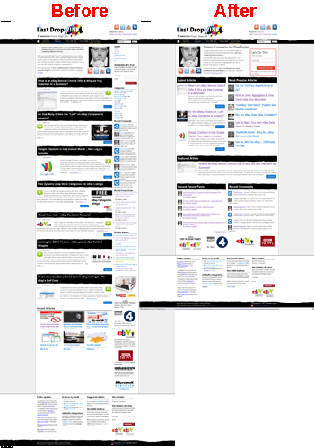
You may have missed it, last Friday the homepage took a hefty re-design and was clipped by a third, but that’s worse right?
Wrong, Shorter is Better.
 If we compare the old landing page to the new landing page, size really does matter as the importance of what is being shown is increased as the number of items has decreased.
Before there were 7 core articles with longer descriptions and 6 sub articles, all arranged by date order, but not by importance to you, the user.
Now we have 3 core articles which are organised by date with larger descriptions, 7 of the most popular articles on the site to the right and one featured article of my choosing.
While this is only 3 articles less compared to the longer version, the amount of space that they take up & the ease of entry into them has increased N fold, because they’re right in front of you now.
And that’s my point, shorter is better because in this case the information that you need from the homepage is only a click away.
Your Layouts
This ports, really well to what you’re doing with your website and eBay listings. Get the critical information in front of the user ASAP and if you must have fluffy stuff (like me and my logo’s at the bottom), put them at the bottom out of the way of the main listing area, so users don’t have to scroll.
This is known as “above the fold” and “below the fold”. Everything “above the fold” is the part of the website, listing or website that the user see’s without scrolling and “below the fold” is everything below the first part of the page that the user sees.
The first part of the page AKA “above the fold” is ultra important, as that is the first part the customer sees when the page loads and is the reference point that the user comes back to, hence the action points should always be near the top and definitely in the the top 10-15% of the page.

Each component of the header and top % of the page is really important, it’s like a map for a user to follow, looking at the image below for eBay & Amazon, you’ll notice that the placements are actually not that dissimilar for the home icon, breadcrumb, search, basket, product image, buy button, product options, prices, help and product sub images.
The only major difference is the layout and placement of the buying option, eBay is the middle and Amazon is to the right. Which makes me wonder, if eBay will ever try swapping these around?
The information the customer needs to know is right in front of them and the desired exit point.
In eBay & Amazon’s case it’s the buy option. Look how big both those objects are in the image above, the eBay buy button is a huge blue block and the Amazon buy box is also a huge blue box, that is no accident.
In my case on this site, it’s the register button, the registration area also being red helps, (which reminds me have you registered yet?), but I am ow wondering if I have made a mistake and I need to swap it to blue?
The New Forums – Have Your Say!
 While we’re on the topic of changes, you’ll see that the lower part of the homepage has been focused away from the content that I directly product in the form of articles & guides and instead focusing more heavily on user driven content?
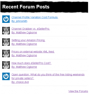
The forums went live last week and the messages left in the new forums are shown on the left and the comments left on articles on the right.
I’m also developing a new widget area to show the latest forum threads, not just the replies so you we can get to the latest threads as quickly as possible.
It’s time that you have your say and while I do my best to cover as many topics as I can, together we are stronger and that’s why I need your help!
If you haven’t registered yet, the forums are now open and waiting your input. You can register here for free and a password will be emailed to you in seconds. I’m look forward to hearing from you.
And Finally….
Now you know about shorter page lengths and that “above the fold” is really important, because that is what the suer see’s first when they come to your product pages. Are your buy buttons on your website over to the right, clearly shown and easily accessible?


Only issue is now I don’t know where to click to see a full list of articles in date order, newest to oldest. I often come back to the site after a few weeks and want to see everything I’ve missed in that time and open each one in a new tab for reading, making sure I don’t miss anything.
I would suggest making ‘Recent Articles’ heading also a link to a full list of articles in date order.
Hi CJ,
Excellent point, i did similar for another site last week, let me find the code.
Matt
Howdy CJ,
See here http://lastdropofink.co.uk/most-recent-articles/ and it’s now in the top start menu :)
Matt