Email Marketing, Why & How you Can Set up Your List In Minutes with MailChimp

Don’t have a email marketing list yet? Need a easy to use sign up box to integrate into your shopping cart or your website? Need a solution that is completely ‘Matt Proof’? Simples, MailChimp.

There are several basic options you have when it comes to gaining subscribers, while not exhaustive, these are some common ones to get you thinking:

  • Sign up from your website
  • Sign up as part of the checkout process
  • Adding signup info to outgoing emails (eg eBay & website despatch emails)
  • Information provided in documentation (invoices or flyers)
  • Sign up as part of your companies blog (not got a blog yet? I have a 101 session on this coming shortly)
  • Buying an a ‘list’ of subscribers (not recommended due to cost)

And all bar the last one, can be done using MailChimp, for free. Did I mention FREE? Sign up here, its one of the most painless email marketing forms I’ve ever filled out.

Why Email Marketing?

Wow, this is a stellar one and I could talk all-day, but I will keep it to one line, brace yourselves, its a big one:

They have Opted-In. They have chosen to hear from you, specifically.

Your Options

Mr Mail ChimpThere are other companies out there. I thought Constant Contact was good, they have a decent library of templates but hits the sweet spot here is that MailChimp allow you to make as many sub mailing lists as you want. Meaning you can have a mailing list for different parts of your business and market them differently (eg blog and checkout subscribers).

The other company worth mentioning is AWebber, but and its a big ‘but’, you have to pay a subscription for even a tiny list. Maybe when you have thousands of subscribers, AWebber should be considered, but I’m assuming you’re just starting out and have a grand total of 1 (thats you).

By the way, here are two big-hitter names to drop, Magento & Mozilla; They both use MailChimp.

Registering & Making Your First MailChimp List

As part of the registration process (takes a few minutes, its super easy), you create your first ‘list’, a big tip when doing this is to use this text as a base of your ‘Permissons Reminder’, just swap the domain bit for yours:

You are receiving this email because you opted in at our website http://websitename.ext/ , you may opt out at any time.

Then once done, along the top hit ‘Lists’ and then the sub link ‘For Your Wesbite’ and if you did make more than one list, select the list you want to embed from the drop down box as show below:
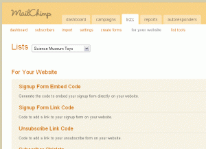
MailChimp Code for Your Website

MailChimp Code for Your Website

Now that you have the right list selected hit the link called ‘Signup Form Embed Code’, this gives you a simple sign up box where you can alter the boxes attributes to your own needs.

Copy the code at the bottom and paste into place on your website where you want a sign up box to be added. Simples? Yep.

For advanced users, you can take the form elements and alter at will; Also I suggest you drop the jQuery includes and put them in the header if you ‘really‘ need them.

Pricing

This is exactly why I am suggesting you use MailChimp, until you get 1,000 subscribers (and yes you will get this and more given enough time), its free.

AWebber is paid for from the start, Constant-Contact gives 90 days, but that still does not match ‘free’. You can of course move to another provider when you topple the 1K mark, but hey, we have only 1 so far (you).

Got WordPress or Another Web Software App, Like Magento?

Even simpler, create your list in MailChimp and then use their ‘plugins’ to integrate directly into your systems back end. I’ve used this on both Magento and WordPress and its soooo easy, set the API key and its pretty much done.

Mail Marketing for Monkeys

MailChimp knows how to cater for email marketing beginners, that’s why they have a fantastic video guide section and weekly 101 sessions. Here is an example:

See I said it was easy.

If you don’t have a mail list started yet, you now have no excuses to set one up, register for free here and get started today.

Need Help?

Still unsure? Already started by getting nowhere? Not sent your first email marketing campaign? That’s what I’m here for, I can help you. We can break your email marketing virginity together and then turn you into a ’email-marketing-campaigns-freak’.

10CMS Presentation – Where ‘Apps’ Are Going, Maybe…

10CMS LogoThis presentation is not the clearest ever made, personally I think the camera on site was probably putting two presenters, John Williams & Rory Dennis off somewhat. However that aside I really think these chaps have something, even through its blatantly clear they’re not actually sure themselves what it is and how its to be deployed.

If you jump to around 11:30 in the video below, you’ll see their product that has enabled the embedding of a ‘hot spot’ and then the ability to take the user to the item or category page. There were other poorly described examples of flash based ‘hot spots’ (although I thought this was a simple to-do in flash anyway).

But getting to the good bit is where John Williams at 12:50 points out the forthcoming issues with ‘apps’ and their deployment. Where the question is raised about deplying such applications to multiple interfaces in multiple products , from the ipad & iPhone to the Galaxy and new BlackBerry.

How the ‘browser’ is likely to become the ‘application’ platform, not the phone itself. By using such an application to then ‘translate’ into the different platforms, without having work about the minute details for each. At first it sounds it might get rather ‘bloated’, but if it increases the time-to-market for multiple platforms, it has to be a good thing.

Dear eBuyer.com, You Could Be Doing So Much Better on eBay UK. Here is How!

eBuyer LogoeBuyer has a personal favourite of mine for technology based products; Since the day I discovered their returns process was simple & effective. After being burned by utterly dire customer support at dabs.com. I’ve sworn my allegiance (well, for some things) to them ever since.
But sadly they are making me go nuts about their eBay operations. I’ll explain why.

I am a Clean data Freak

I am the biggest data-freak ever, in my conversations with new clients, besides the formalities of hello and getting a coffee in (note if you want to bribe me, coffee works exceptionally well) I am interested in what their data is like.

This is for the simple reason, if you have great, clean data you can do anything and I mean anything with it. If you don’t, its going to get messy.

Data Freak

Lets take a Wander

Now with this little preface over, lets see why eBuyer would make me nuts…

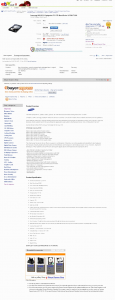
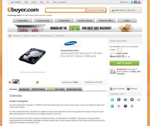
Lets take a look at an item from their site http://www.ebuyer.com/product/173804 and a screen shot of this item is below:

eBuyer Item Details Page

eBuyer Item Details Page

Now lets make a bullet point list of the features and crucially the data they have on their item details page for this product:

  1. Item Title
  2. Item Image
  3. Description
  4. Specification
  5. Related Products
  6. 104 Customer Reviews
  7. 114 Discussion Topics
  8. A  ‘urgency-generator’ in the header. Order up to 11 for next day’

* takes a deep breath*

eBuyer HD103SJ on eBay

eBuyer HD103SJ on eBay

Now lets look at their eBay Listing for the very same product  http://cgi.ebay.co.uk/Samsung-HD103SJ-Spinpoint-F3-1TB-Hard-Drive-SATAII-7200-/ and again a screen shot is to the right. Click on the image to see the full version as its rather long.

Now the key points they have are:

  1. Item Title
  2. Product Image (but not in the listing area)
  3. Product Description
  4. An added bonus of a ‘Storage Calculator’
  5. A not very well formatted specifications section
  6. Some related items

Now can you guess what I am going to talking about next? Yep you guessed it, poor usage of product ‘data’, in this case how they’re making two mistakes that with the right tools (and will) could be easily joined.

Suggested Changes to eBuyers Listings & Why + Tips For You!

Here are my suggested alterations, if you have similar data then I strongly suggest you follow suit to aid conversion of your listings.

  1. Add a Listing Template with ‘Branding’
  2. Add the product image to the description area
  3. Add a ‘Urgency Generator’
  4. Format the description into its own container
  5. Format the specifications in its own container
  6. Add dynamic related items
  7. Add related product groups
  8. Add the top rated customer reviews to the listing
  9. Quote the answers from the forums

Now, lets work these out in some more detail:

Add a Listing Template with ‘Branding’

What do I mean by this? Image is everything and currently it looks pants.

In the case of eBuyer, get your in-house design department to make a listing template, if they are incapable, outsource it for £500 (and tidy the shop at the same time).

If you are not fortunate to have an ‘in-house design team like the rest of us, outsource it. You can get simple templates for free and quality customised ones for £500 (contact me for details, I’ll post information about this in a later post).

Add the product image to the Description Area

Not hard at all, eBay images are OK, but you can gain more flexibility in the eBay listings themselves. There are countless examples of this, just search eBay for a few top rated sellers, most have got the idea. Again this would be part of the formatting in the listing template mentioned above.

Add a ‘Urgency Generator’

This one-gets-my-goat big style, where the * hell is the urgency in this listing? Take the logo in the header area of eBuyer.com, chop it up and slap it in the listing.

If this is for you, then a strong call to action is always needed. This could be the re-confirmation your USP (Unique Selling Point(s)) or a time deadline for ordering. If you’re stuck for ideas, write ‘Order Today, it’ll be with you in a maximum of 3 days’ (at least its a start…).

Format the description into its own container

We are dealing with great data here, so format it just as ‘great’. Give it a container (visual area) of its own and then do the same for the next part too.

Make the description stand out by darkening the outside of it, so the eyes are drawn to it. Customers are sheep, herd them.

Format the specifications in its own container

Arrrrrrrhhhhhhhhhhhhhhhhhhhhhhhhhhhhhhhhhhhhhhhhhhhhhhhhhhhhhh

We are selling a highly technical product here, just like on the website, make the specifications clearly readable.

If this you and have a product that requires a ‘product specification’, make the table that is formatting the data, clean, clear and alternate colouring on lines and highlight key specifics.

Add dynamic related items

Ok, this is  9/10 for effort, as its better than what is being shown on the eBuyer.com website. But it hard-coded, go for dynamic tool to display items automatically, there are a few out there, check the eBay solutions directory (again noted for a future post).

Add the top rated customer reviews to the listing

Ok, here is the ground breaker… I should be charging for this stuff I tell ya. Lets spell this out:

I am eBuyer, I sell this product, this product has 104 customer reviews

Pillow screams x 10

So you have the data in the eBuyer.com data base, so why not spill the top 10 rated reviews onto eBay? Surely this is a no-brainer? 104 people have left reviews or questions, does it not make you think that out of these 104 reviews or questions your new eBay customers might ask the same? (insert pillow scream).

Two databases, common key, join them, deliver quality content, format it, sell loads.

(ignore that top bit, thats my mind working it out in simple terms)

Quote the answers from the forums

Now this one is a ‘grey one’. If I was eBuyer, I’d push this and bring in the form posts and also link back to the forums, as its helpful info to the product buying decision. Kinda grey due to the eBay links policy, but I’d personally argue this one for quite some time.

Summary

If you have great data, then get it in and use it. This is why the eBuyer listings on eBay drive me nuts, we know they got great data, its on display on thier website, so where is it on their eBay listings?

If you are having similar issues or need some guidance on how best to implement your data as effectively as possible, see the top right of the page, the number is there…

Update

I just spotted this on YouTube, I’m not posting a video reply with fear I’d pillow scream to much, even they know they’ve got a serious issue, branding boys, its all branding!!!!

PS. ebuyerdotcom you got mail on YouTube :)

Pre-Season Email Marketing 10 Point Checklist

SnowmenI’d have loved to have claimed this as my own, but thats rather naughty. Check this very useful guide out from Silverpop here.

The key point here is really do not wait to very last moment to turn on your email marketing campaign on, start it immediately!

The 10 points in their checklist are:

  1. Make subscribing as appealing and easy as riding a sled down a hill.
  2. Manage expectations with a holidaythemed welcome program that’s warmer
    than a cup of mulled wine.
  3. Make informed frequency/cadence decisions that won’t freeze out overwhelmed shoppers.
  4. Get customer data together, check integrations and apply list hygiene—in other words, make your list and check it twice
  5. Test message templates and optimise so they’re prettier than a Christmas card.
  6. Create cart-abandonment and browse campaigns that provide quick reminders to distracted shoppers.
  7. Give recipients the gift of choice—offer an unsubscribe preference centre.
  8. Fine-tune your social-sharing initiatives— ‘tis the season to spread holiday cheer, after all.
  9. Optimise transactional emails to offer value beyond generic bah-humbug receipts.
  10. Create a post-purchase email strategy that keeps the holiday spirit going strong through 2011.

So when was the last time you contacted your customers and marketed your USP’s to them?

Don’t even know where to start? No time to even make a start? Know full well its on the to-do listing and it just never gets done?

Easy, contact me at the top of this page, we’ll have a chat and I’ll point you in the right direction (or push, or just plain do it for you) .

Part 3 : SuperDryStore eBay Shop – The Not-So Good Points

Carrying on from where I left off in Part 2 : SuperDryStore eBay Shop – The Good Points, time to get into the not-so-good points. These are in no order of importance I hasten to add, they all need consideration though:

SuperDry – eBay Outlet?

If this is the fastest moving account of eBay’s and thier token ‘we’ll-put-a-SuperDryStore-item-on-daily-deal-at-least-every-other-day’ account (I kid you not, look at the RSS feed for the daily deals, should be called ‘SuperDryStore Deals’). My point being, SAY you’re an eBay outlet.

Referring back to the models back in Part 2 put your best assets forwards and being an eBay Outlet is a damn good asset. Add the eBay Outlet logo, announce it clearly.

This one scores 10/10 on the no-brainer score chart. Always put your ‘Unique Selling Points’ (USP’s) forwards in the best possible light as possible.

So… Nice landing page, WTF happened to the rest of it?

For those not converse with leet-gaming-speak, WTF stands for ‘What the F***’ and in this case is makes the point perfectly.

Homepage: http://stores.ebay.co.uk/The-Superdry-Store
WTF Happened to the Design????: http://stores.ebay.co.uk/The-Superdry-Store_Mens-Superdry-Bags/_i.html?_fsub=309702719&_sid=401545409&_trksid=p4634.c0.m322

See my point now?

This isn’t just a one of those crap 1/2 done sites that Frooition have been making [a ‘pretty’ home page and a ‘shop header’ and then failing to theme the rest of the site, example here] its an utter annihilation of the homepage and then some.

  • Where has the left menu gone?
  • Where is the search box?
  • WTF has happened to the three USP’s?
  • Where is ANY sign of ANY branding?
  • I’m lost. Who was this again? I’m leaving.

On a serious not, this is not a joke. DO NOT MAKE THESE SILLY MISTAKES (wow I have resorted to using caps lock), but hey, this is seriously poor form by all parties.

If you have a brand or even just a little logo and a colour theme, then carry this theme consistently from your eBay shop home page, to your search & category pages, content pages, into emails, into your website, into… everything, its your brand.

Learn By (much better) Examples

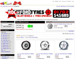
Here are two examples, one where they have paid for a shop design and one where they have at least got a common brand going on.

OutdoorValue eBay Shop RochFord Tyres eBay Shop
http://stores.ebay.co.uk/outdoorvalue/ http://stores.ebay.co.uk/Rochford-Tyres

Looking at OutDoorValue’s eBay shop, the branding is clear and carried to all parts of their business. eBay shop, listing template, shop pages, search pages and most importantly their website.

Rochford Tyres while not the most ascetically pleasing, has got most boxes ticked, their brand appearance is ‘remember-able’ and is common across their eBay activities, although their website is of a differing name http://www.alloywheels.com/

The point being, if you have a a ‘brand’ use it everywhere.

Singular ‘Front of House’ Model

After ‘dissing’ Missguided.co.uk a few day s back in this post about a silly design flaw, what they do very well is have an extremely ‘fit model’ for the majority of their artwork (see here for an example, stunning eh?). They have diversified since and introduced more models over time, but the point is that a ‘common face approach works’. If you can afford a model, use one!

Dead Categories

Out of the 18 categories they have in the left menu of their site, they have four that contain no products, thats a 22% chance a browsing buyer is going to go to a dead page, nice.

The biggest tip here is to use the eBay categories menu bar and refrain from using hard coded category menus. The eBay category bar updates automatically depending on your item counts, while not instant (insert private joke about eBay saying the eBay shop updates instantly and it took 24 hours with a massive UK retailer *coff* Tesco’s *coff*, oh how that made me giggle) it does update eventually with no manual coding.

Clothing = Clear Returns Policy

The #1 concern for the people I have spoken to when it comes to clothing is “I need to feel reassured that I can return it if it doesn’t fit or if I plain don’t like it“. SuperDryStore fail on this and get a 1/10.

The ‘tiny’ returns page link is along the top and should really be featured in the main description or header somewhere. Even if you have a poor returns process, 90% is appearance and 10% is doing.

The returns page is cluttered, cut to the point, spelling out in simple terms, make some bullet points about it. Lets have a suggested version of this page, cutting out the waffle:

7 Days from Receipt Returns, No Quibble Returns Policy

  • We gladly accept returns
  • Refunds processed in less than 5 working days
  • Sorry, you cannot return to one of our stores

If for any reason you are not 100% satisfied with your amazing purchase from the SuperDryStore, just let us know by using the eBay Resolution Centre. If you’re not sure, see eBay’s help page here or of course you may contact us directly here.

See that’s a lot nicer than the ‘stuff’ they got cluttered on their returns page and gets the point clearly and efficiently across. Although if this is yours I’d suggest you add a little more content around this after it and especially include your address.

Last eBay Shop Gripe, ‘The Picker’

If you’re going to pay for one of these item pickers for your home page, make sure the organise it in alphabetical order. Joe-Public-Customers are idiots, don’t try and make them think, they’re just not capable if it. Its your sole job not to let them think.

Its Your Store, Use It

Only you are responsible for your own store, even if you just add a logo or tidy up your returns pages, its a bonus. As I said above, its ‘our’ job to make sure ‘Joe-Public-Customer’ does not have to think and making him panic by loosing ‘branding’ for what is a very easily solved issue is going to you loose you customers.

Click here to view part 4 of this series

Why I’m feeling Rather Smug – 65% Website Speed Increase

I can’t remember the exact facts this, although I am sure Google will easily spill the beans on them, but for something like for a 100ms speed lag in page load times, you loose a 1% conversion on a website (believe this was a Amazon quote).

The point is simple, slow sites suck (and cost viewers) and fast sites rule.

This has been amplified by Google now taking page load speeds into account when ranking websites, see here an idol of mine, Matt Cutt’s blog post on this and also in the Google Webmasters Blog, I strongly suggest you read both of these articles before continuing here.

So why am I feeling smug?

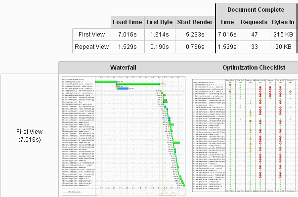
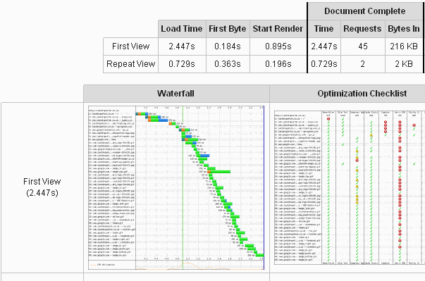
I went from a whopping +7 seconds page load time, to a mere 2.5 seconds. Yup thats a 65% increase in speed. I was most impressed and the beautiful thing is, I could get more out of this as well!

Lets look at the tests before and after, to drool at the results in all their glory.

Before Optimising

Website Speed Starting at 7 Seconds

Website Speed Starting at 7 Seconds

The full report can be seen here: http://www.webpagetest.org/result/101105_AQ18/

After Optimising

Website Speed Under 5 Seconds

Here are two links, just to show there is a decrease http://www.webpagetest.org/result/101105_AQ28/http://www.webpagetest.org/result/101105_AQ2Z/

What Do I do?

Well, I ditched the wp-cache plugin and chose something a little ‘meater’, W3 Total Cache. I chose this plugin because of the excellent reviews from industry guru’s and because I am intending to add a true CDN (Content Delivery Network) shortly (rather than using a cheat subdomain).

But this was only half the story, when looking at the details the testing site gave, it was horrifying to spot that the wp-polls plugin was adding a massive 2 second lag on one of the tests, so that really had to go, adding in several other tweaks, setting in the cdn on a subdomain, totalled a heafty page speed saving.

The biggest bonus of all, I can still improve, even after just 20 minutes of work, the images used are not optimised fully and I am sure I could squeeze a 0.5 second saving at least from focusing on them, let alone minimising css usage, code and so on… But to save time, I’m only going to focus on the new images I add and do my best to not compromise quality over the page-load speed influence.

The Question is…

How badly does your e-commerce site or blog lag? Have you even checked? How many customers are you loosing because of this? And… what are you going to do about it?

Dan Wilson: What are your nuggets of eBay selling advice?

Online Business Forum eBay

Online Business Forum eBay

An interesting question came up in the LinkedIn ‘The Online Business Forum powered by eBay‘ group by Dan Wilson and I think I am only one probably prepared to spill anything of any substance (I might be wrong by the time this is released), here is the question in full:

What are your nuggets of eBay selling advice?

I was asked last week for some advice regarding online selling by a journalist. The hack in question wanted little known tips for an article he was writing. Needless to say, I had a view. Here’s what I said:

Don’t sweat the small stuff.
Dealing with trouble customers and problems takes time and time is money. Sometimes quibbling over a few pounds is just not time or money efficiently spent. And when it comes to customers, there really are just some people who can never be satisfied, so save your energy and don’t try. Refund and move on. Finance this by making sure you build up a notional fund for such situations. The size of that will depend on what you sell online, but a small levy on everything you sell soon adds up because most customers really are lovely.

Are you getting the best deal on fees?
On eBay, there are several ways of getting better, lower fees. The first is an eBay Shop. Just by paying a subscription, you can get preferential treatment on the fees for BINs in particular and that can significantly lower your outlay if you want to expand the inventory you have available in the marketplace. And don’t forget PayPal. The merchant rate offers lower PayPal fees if you’re taking a lot of money through the system. But you do have to ask!

What’s your best little nugget of online selling advice? Or is it too good to be shared?

After writing what was a hefty reply, I decided it would be worth beefing it out and including it here for all to see. I’ll keep to my two points I could go on a blogging-bender quite easily.

Point 1: Do not devote 100% of your business to eBay

Amazon UK

Hey Look Amazon!

Its a mistake I made a long time ago and will not let clients make the same one. If eBay is taking up more than 40% of your over-all business turnover then you have a *critical business issue* and need to diversify your marketplaces, FAST.

I’ve said for a very long time that I am sure that sure that eBay does what it can to cause maximum impact to sellers to keep them ‘entertained’ with the eBay marketplace. The entire selling process could be a lot simpler and dare I say it less ‘unique’ to each buyer. eBay selling can-and-will hog your time, you need to be wise to this and look for ‘tools’ to aid you to diversify into other channels.

I’ll come back to viable actions for this point later in this post.

Point 2: My other tip is risk Aversion.

The point here is to not rely solely upon a single eBay ID. This could mean breaking ‘eBay policy’ to some, but I see each eBay ID as a ‘business’ in its own right and if done well it acts like one too.

To list on eBay has never been so cheap for pretty much ALL eBay sites, yes ALL sites, not just the eBay UK site. By spreading the risk of selling on eBay into two or more (20 plus is not unheard of now) eBay ID’s that have specific persona’s and product cross overs can be done from well managed backend systems.

Once you have created your inventory in a backend management tool (Channel Advisor ‘loosely’ fills this spot, eSellerPro is suggested [yes I used to work there, hell there is not one part that I didn’t influence. blah blah blah its ace]). The point is that to prepare the data for a second eBay ID is a fraction of the work, to prepare it for many eBay IDs (including on multiple sites) is again ‘a fraction’ of the initial work.

By spreading your inventory groups over more than one eBay ID, loosens the reliance upon a single point of income which in my eyes is a bad thing. It also allows you to focus each business (eBay ID) on to its core role. This does need to be done well and its a whole topic for another day on how to do it well (if I ever decide to divulge this info publicly, actually I doubt it).

Expanding Upon These Points – Real Life Tips

Now here some real life tips you can action really easily if you have the right tools.

Here is a no brainier, did you know that the vast majority of the eBay US categories are exactly the same as the eBay UK ones? That means porting your eBay UK data to a eBay US eBay ID is really quite easy, especially now that both sites are using custom item specifics for almost all categories? The same goes for nearly all the other sites too, they all have a common base, just with a few tweaks here and there.

Settle for the ‘Other Category’ if you have too, if its a decision between actually getting listed and getting the categories right, screw the cats, get the items on. You can sort out the re-categorisation (not mess as I first typed) later.

Also remember that America is massive, buyers are used to orders taking over 10 days to arrive for non expedited services and guess how long it normally takes for a UK parcel to arrive in the US? Yep you got it, about 10 days!

The second is a set of two questions:

  • Do students really cost that much?
  • Does outsourcing your language translation requirements sound really that scary?

Now leading on… eBay Germany [DE] is bigger than eBay UK and they will pay by PayPal (used to be a big issue, as those Germans love bank transfers). Yes thats right eBay Germany is BIGGER than the UK, let that sink in for a moment.

* let the dust roll by *

Sunk in? Here’s an idea for you, use Google Translate on your top 10 products, now search on eBay.de for them, making an excel spreadsheet as you go, then use xe.com to get the latest rate, the numbers work? If you have a Terapeak account, pay the extra and research the foreign eBay sites, I guarantee you, you’ll start feeling sick.

I Need Help Now!

I’d love to, but cannot commit to anything before the new year due to prior commitments. My content creation team is working literally 24/7 currently and its time I start looking at a VA (Virtual Assistant) again. Hey at least I’m admitting my flaws! Are You?

Anyway, its the reason why I have published this in front of the other posts that were due to be released, at least I can help you go in the right direction.

Oh Come on… You got to be Serious Right?

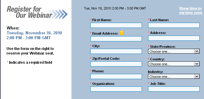
Checking the spam box earlier, I notice a mail from Internet Retailing and a webinair entitled ‘The 5 Best Techniques for Recovering Abandoned Shopping Carts with Email and Social Media‘.  Here is the opening line:

Have you measured your shopping cart or web form abandonment rate recently?
Recovering abandoned shopping carts and web forms is a lucrative business. On average 70 percent of shopping carts and 62 percent of web forms are abandoned before completion.

Have you seen the form they want you to fill out? Seriously, how can you suggest that your company is an ‘expert’ at tackling cart abandonment when the ‘tool’ you’re using does think there is a world out side of the USA.

Recovering Abandoned Shopping Carts Form

Recovering Abandoned Shopping Carts Form

I wonder what the abandonment rate is for this form & how much ‘crap’ data people enter into it? There was two comment boxes, neither particularly clear, you can bet I left a comment.

I’m hoping their content will be a lot better than their first impressions….

E-myth Revisited Book Review

Why Most Small Businesses Don’t Work and What to Do About It Review

e-Myth RevisitedI’ve just sent a copy of this to a client, my copy is out on loan currently!

I just love how it reads, I enjoy how Sarah actually takes what Michael is describing and transforms it into her picture of how ‘All About Pies’ business will become, I even think regularly of the orchard is to nurture.

The part where Michael describes the hotel owners game is brilliant, you don’t actually meet the owner, but you meet his amazing ‘game’ and the people that play his game. Its extremely inspiring.

In realising that there any several parts to play in a business and ‘technician’ is only a small part, getting your butt out and working ON your business rather than IN your business is a revelation to all (well it was to me!).

I don’t just recommend this book, I categorically state you should read it, its THAT good.

You can pick the E-myth Revisited on Amazon for around £6 herea tip here is to go careful with the non Amazon sellers, the first six or so are from the US & Canada and the last book I picked up from bookcloseout took three weeks to arrive, my point is, the extra pennies spent in this case are well worth it for massive increase in speed of delivery.

PS: Don’t just take my word for it, check the reviews out for this book, steal yours today.

PayPal needs your input – PayPal Bribes @ £65 An Hour!

Wow I’m in the wrong business, check out the mail below, we’re being offered £65 an hour if we pass the survey test, I need to go back to being a full time ‘consumer’. I’ve completed the form and are waiting eagerly!

Paypal-bribes

PayPal Customer Survey @ £65 An Hour

Fulfilment By Amazon Webinar: First steps to get started

Fulfillment By AmazonJust received this in the email queue, defintely worth looking at for anyone whom is considering using FBA:

We are pleased to invite you to this webinar where we will present best practices and tips to get started with Fulfilment by Amazon, including:

– How to select the most suitable items in your inventory to convert to FBA
– How to send your first shipment, avoiding the most common errors
– How to check the health of your FBA inventory to make sure you made the right decisions

This webinar should be useful for:

– sellers who registered for FBA but who are not sure how to get started
– existing FBA sellers who want to make sure they use all the correct techniques and practices to manage their FBA business

Title: Fulfilment By Amazon: First steps to get started
Date: Tuesday, November 16, 2010
Time: 13:00 PM – 14:00 PM UK time

Registration Link:
https://www1.gotomeeting.com/register/79572300

Part 2 : SuperDryStore eBay Shop – The Good Points

SuperDryLets start by looking at SuperDryStore ebay shop, you can view it here: http://stores.ebay.co.uk/The-Superdry-Store. There are definitely some great points to be noted and also some silly mistakes. I’m looking forward to explaining these to you in the next few paragraphs.

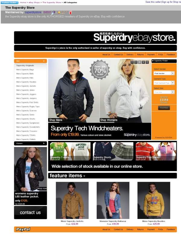
Here is a full screen shot of the SuperDryStore eBay shop:

SuperDryStore eBay Shop

SuperDryStore eBay Shop

The Good Points

Lets start with these, its very easy to be negative and point and poke’n’point at someone else’s work, but thats not constructive and there are some great things to note; In no order of importance, these are:

  1. High Impact Design
    It has to be said, that branding is absolutely key. In this instance the ‘SuperDry’ logo is melded nicely with the ‘eBay Store’ text (note on this later).Then use of three primary colours, black, orange and white (yes white is a colour) is great, the objective of a great design is to carry across the companies ‘branding’ and to be ‘rememberable’.Jump of their page for a few moments, then ask your self ‘if my life depended on it, could I draw their shop’, if the answer is yes, the company has done a pretty good job.
  2. High Quality Images
    This is another key factor to a great looking design. If you have poor image quality or a sheer lack of product or lifestyle imagery then you’re letting yourself down.While I feel there is a lack of a singular ‘front of house model’ (I’ll cover this later), the flash slides are good and have a common feel to them. Its very tempting to whack together some slides and upload them. Doing so will give a junk yard feel, sit down and draw a maximum of two slide outlines/templates and stick to them.Flash objects such as the one being used on the SuperDry store are very easily picked up using Google for free, if you are after a custom layout, flash developers are pretty darn cheap if you can specify exactly what you want. My guidance on this is be wary of total file size of the flash object and the slides and keep to common theme and template the slides, so not to ‘visually confuse the browser’.

    If you are thinking ‘High Quality Images’ are expensive, get real. Lookup iStockPhoto and start searching, also you can use images from Flickr if you read the licenses properly. Take the header image of this site, as part of the creative commons licensing, I was able to use the above image as long as I post and link back to the author. Oh and if budget-challenged, try Paint.net its a free image editing software and is excellent.

  3. Organised Layout On-The-Homepage
    The note here is ‘On-The-Homepage’, I’ll cover off the sub pages later. Its what I call a ‘Split 2 column layout’, there are two main columns, but the right content block for the first section is broken into two.Categories categorically go on the left.Now there there is room to maneuver on this for homepages, I’m sure you’ve seen how the vast majority of the bigger internet shopping sites will move from 1 column layout for the homepage, 2 column for category view and then either a double or single column layout for the item detail pages.I’m a bit disappointed about the limit of just three real items on the bottom, I’d have personally preferred six and from a wider product range.
  4. SuperDryStore HeaderClarification on being ‘the only official outlet’
    When you have an unique selling point, SHOUT ABOUT IT. The statement below is pretty good:

    “Superdryebaystore is the only authorised re-seller of superdry on ebay. Buy with confidence.”
    I’d however suggest they alter it to:“Buy direct from of SuperDry, Quality, Service & Value Assured”

    But I do like the ‘the only authorised re-seller’ part and maybe the following is a short alteration to maximum impact:

    “Superdryebaystore is the only authorised re-seller of superdry on eBay.”

    Although this is quite hard without knowing their business goals for the platform.

    If we think about this for a moment for your business, try and summarise what your business is and how it is different from every other business into no more than 12 words. Adding ‘Established 2006’ or similar are also killer terms, as they immediately add ‘age’ and ‘trust’ to a brand, especially if its situated below a brand logo.

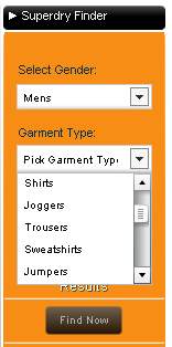
  5. Item PickerSuperDryStore Picker
    Now I suspect this is one of OBaid’s creations. Obaid is a developer that worked on Amazon.com’s TV picker. While I am not a complete fan off such ‘item pickers’ (mainly because I think it can be done in less code and be more widely accepted in Javascript) the decreasing numbers of items is cool and in this instance the levels have been well thought through, but some plonker has forgotten his alphabet when it came to ordering them!If you sell complex item types, then such a ‘tool’ is suggested to help your buyers locate the items they are looking for.
  6. SuperDryStore Fit Model

    SuperDryStore Fit Model

    Sex Sells – Use It
    I don’t care if you take offence here, Sex-Sells and thats been a known fact since year dot.So… SuperDry have have almost got it. The woman on the left is pretty ‘fit’, the same for the model in the middle ‘featured items’ section. However the minger, I mean ‘model’ n the flash gallery could at least simile and push the chest out. The same goes for the male model, bush the pec’s out and hunch forwards a bit more.

    SuperDryStore Eaten a Wasp

    SuperDryStore Eaten a Wasp

    When some is buying an item, especially clothing, ignoring the brand, they are asking themselves ‘will this make me look good’ and if the model looks great in it, then that helps them to believe they will do too.

    This does not mean, getting a lap dancer and a male stripper, it just means if you use a model, make sure they look hot and push their ‘assets’ to help the customer make a decision on whether this item is good to make them look ‘great’.

  7. Content Pages
    At least SuperDry has actually created some shop pages, most sellers don’t even know they exist let alone use them. The content is pretty poor, but 5/10 for actually using them. See http://stores.shop.ebay.co.uk/The-Superdry-Store/About-Us.html as an example.If you’re not using the shop pages, then you’re missing out, see http://pages.ebay.co.uk/help/sell/stores.html for eBay’s pants help files on the subject (there isn’t one). I’ll be covering this off later in more detail.

The ‘Good Points’ Summary

I think I’ve remained pretty positive so far. There are some good points to be learnt from SuperDry’s store, even though I suspect they got it for free from eBay’s Indian designers whose designs have been pretty crap, eg Dune, hell, them all bar Office Shoes.

Just remember these key points for now:

  1. Great Quality Design.
  2. Organised Layout to Industry Standards.
  3. Promote your ‘Unique Selling Points’ (USP(s)).
  4. If you offer complex items, make it simple for the buyer to find them.
  5. If you have control over whom is wearing or sporting the goods, put the best ‘assets’ forwards, it sells.
  6. Use content pages, with proper content.

Next Time

Keep peeled for the next instalment [I’ll be getting the daggers out] as there are some shockingly silly mistakes that are being made. After I’m done you won’t be making these same mistakes and it won’t cost you hours or thousands of pounds either.

Click here to view part 3